Shape Art: An experiment in my arts and design journey

The heading for this article is probably confusing given what you already know about me. Whatever that may be; Data Visualization? Tech Journalism? Media and communications? Mental Health? Faith? Events? But stay with me here.
First a bit of context. It’s been 8 months since I started my MA Data Visualization programme at the world’s second-leading arts and design school; the University of Arts, London. While the programme is interdisciplinary, at heart, the school is mostly for artists, designers and creative technologists.
Given my background as a … (*struggles to select one*) … data analyst, without prior arts and design experience, you could say I initially felt out of place. It was the same during my 3 months at the Parsons School of Design which by the way is the third leading arts and design school in the world. I did struggle a bit initially to match the artistic and creative expectations.
But I have just realized a pattern. I’m beginning to find my path with something I am going to call Shape Art. I have a tendency to default to shapes in my making and my craft. This is especially for my work around data visualization.
Well, it might not be unique if you consider that shapes are one of the seven elements of design. But when a data designer or creative constantly defaults to mostly or only basic shapes in their making, then there’s something in there. And given that every artist has their unique style, and strength and leaves a mark on their work, I think I might be on to something here.
I can’t claim a stake in the term ‘Shape Art’ though. I have seen it called Geometric Shape Art elsewhere. It is beautiful, at least to my eyes. (See cover image and the one below.)

Samples of my work with Shape Art
I will show three examples of my work with shapes or Shape Art. The first time was when I was asked to respond to the popular data viz clock problem, I chose shapes. The challenge asks you to visualize a clock without using a clock and numbers.

I called that work the prayer clock as it was inspired by the Islamic prayer times. Each circle represented the sun and the colours and sizes indicated what time it was; sunset to sundown. The triangle and line showed the position of the clock.
In 365 days of data visualization (it’s been a minute *tears*), another one of my works, I share what I’ve been learning about data visualization but I try to explain it pictorially again using, you guessed right … shapes.
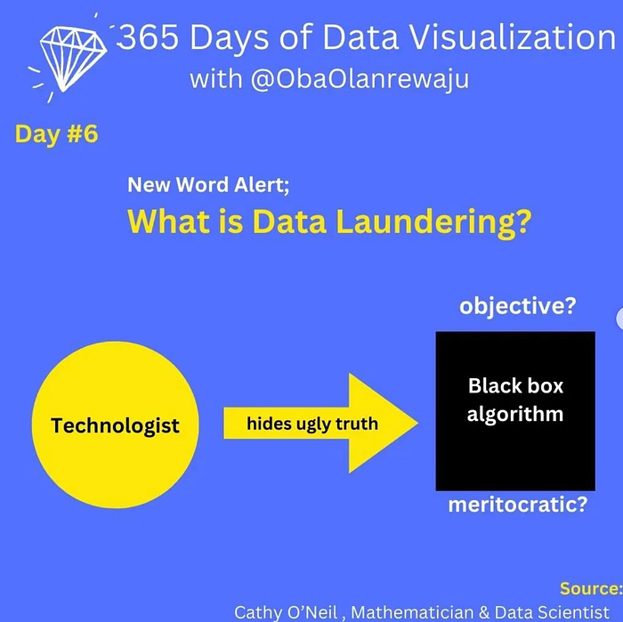
I particularly like the installment that talked about data laundering which is the act of taking stolen data and trying to make them legit. While the image isn’t a data viz, it is an important piece of design.
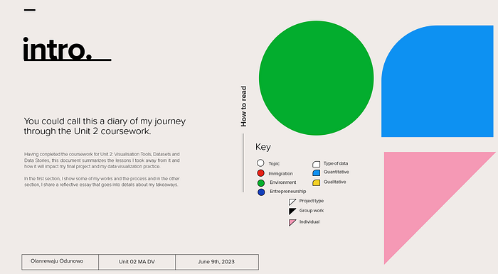
Finally, I recently submitted coursework and in it I created a nice data viz that highlights my portfolio; some of the work done during the course.

What’s next with Shape Art?
I honestly don’t know yet. It was a lightbulb moment and I was excited to see that I had found a path, (my unique style maybe?) in arts and design. This is important given my initial struggle with arts and design school expectations. So imagine my excitement when I discovered this.
I will continue to experiment with it and will create more work in the future especially data visualizations. So expect to see more of this.
Thank you for reading and sharing in my excitement. Now back to work or the weekend?
